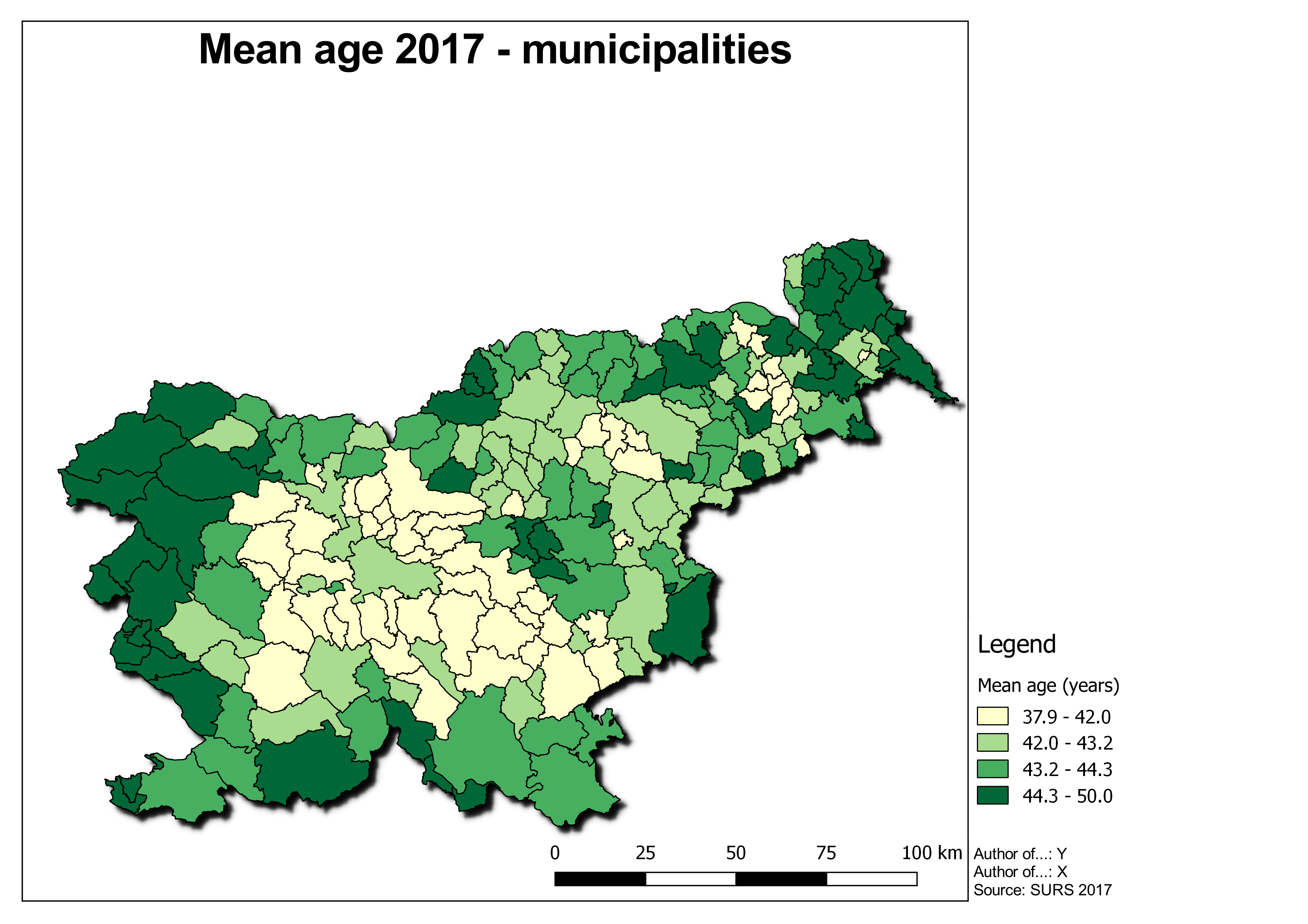
We do spatial analyses to answer a specific question we have asked ourselves. In most cases, we want to present this answer as a map.
A map is an abstract symbolized picture of a geographical reality that shows the selected objects or properties and is the result of the creative work of the author, intended for usage where spatial relationships are essential. The map is therefore an image seen by a human being – the user. (Petrovič)
It is difficult to transfer creativity from person to person and offer a recipe for the “ideal design”. But there are some standards that define good maps.
Good maps contain:
- A display area
- A title
- A legend
- An information about the scale (graphical or numerical)
- The orientation
- A colophon with the authors of the content, map, resources, copyright holders and citations
There are more elements, such as cartographic projection and mathematical elements, but in our cases they did not seem necessary.
In addition to displaying elements, we also need to know the formats on which we will export this product. The map can be exported in vector or raster format. In case that we want to print the map, it is important to know the difference between the basic RGB and CMYK colour maps.
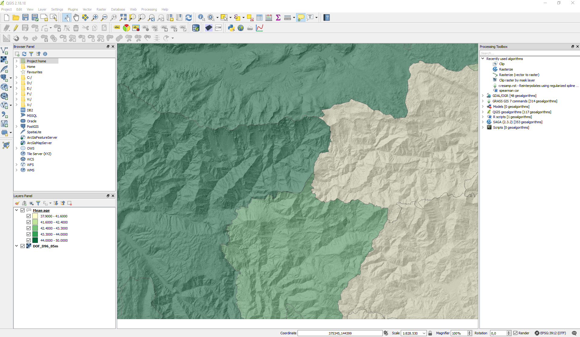
We will start creating the map by first editing the data in QGIS and then editing them in the Composer Manager. We want to create a map of average age distribution (municipalities, 2017). We will do this by defining the first color-based Style based on categories.
Steps:
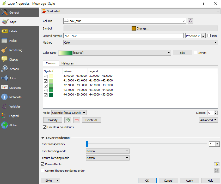
- we edit the style and choose Gradual Style Design
- we mark the data field, the color scale, the number of categories and the classification mode
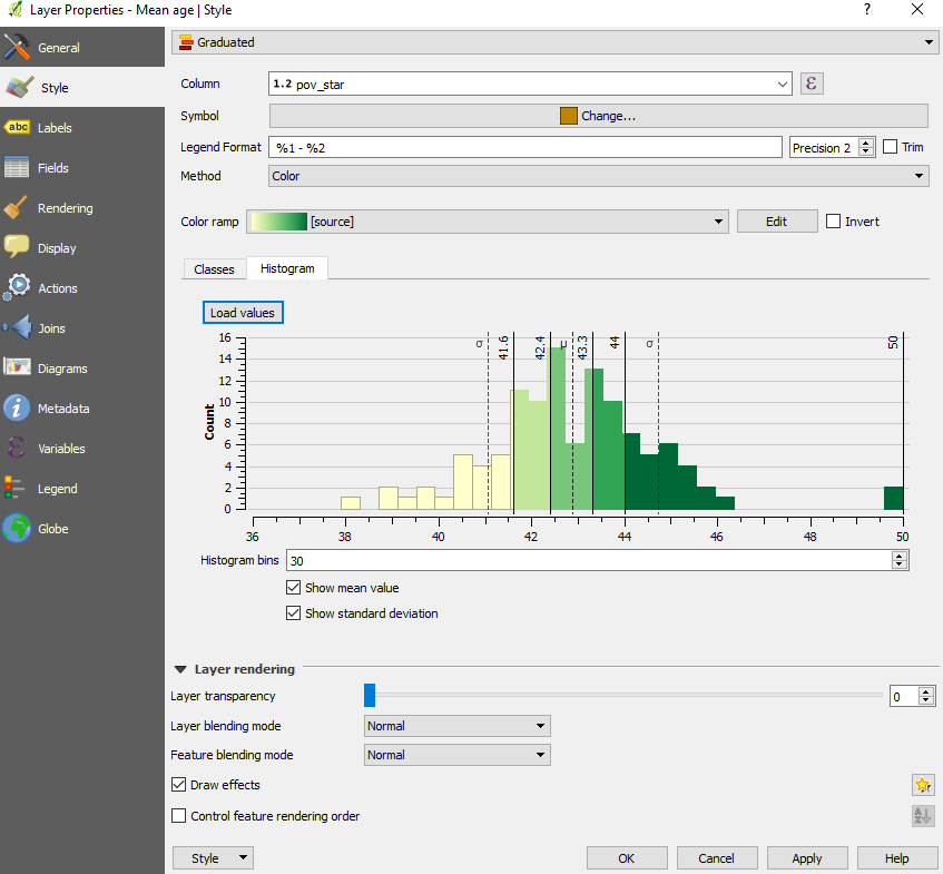
In case that we are interested in the visualization of the data range and distribution we can look at the histogram, which can help us with choosing classification mode.
We added an additional shading effect by selecting additional shading on Draw effects.
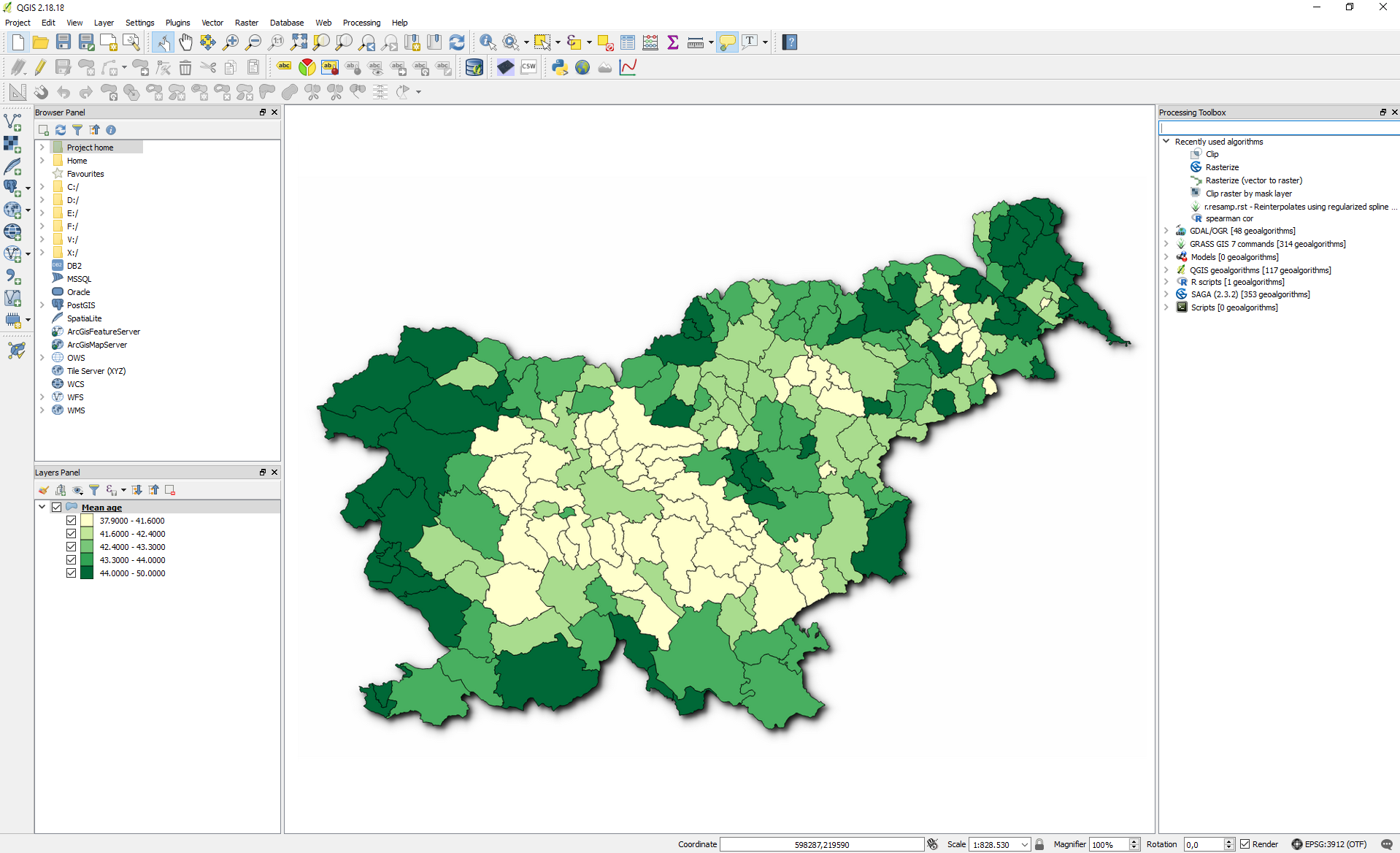
We can continue to design in various ways with overlapping different layers, adding labels etc.
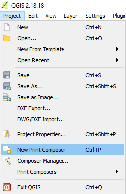
We will continue our creation with the tool Print Composer.
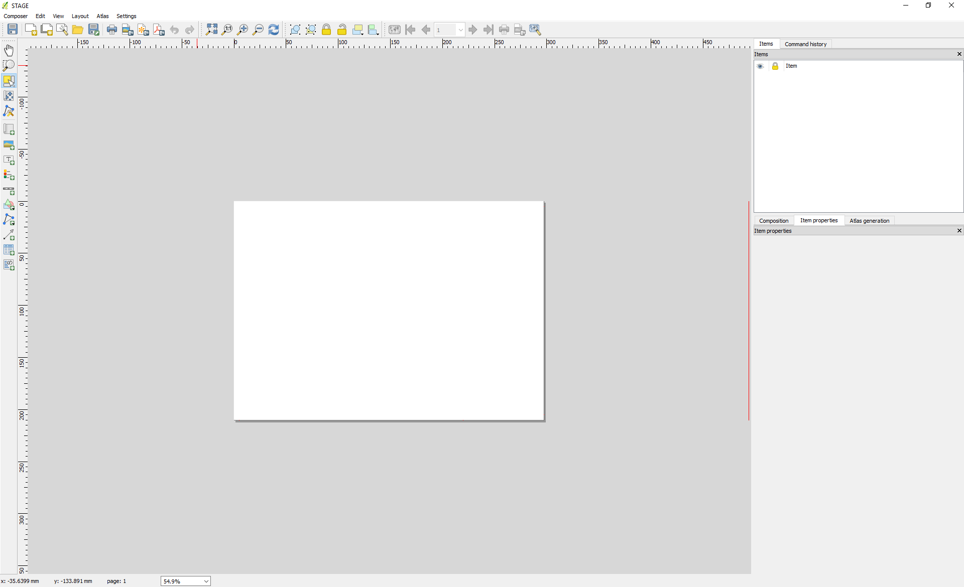
A new interface is opening up for us.
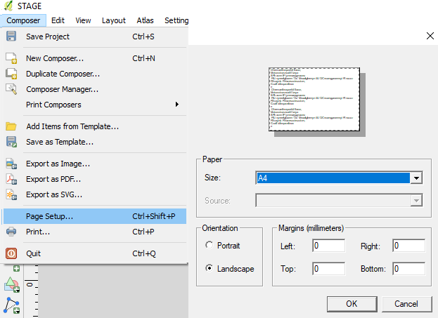
First, what we will set up is the page format. We selected an A4 landscape.
By moving along the ruler of the interface, we defined the area in which we will display our graphics.
With Add Map (Layout tab), we added our data to the display area.
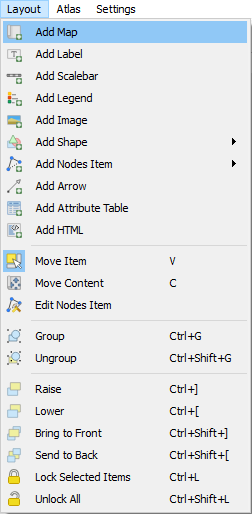
The added item appears in the toolbar in the left-hand corner of the widget. Since we are satisfied with the placement, we have disabled the editing of the view by marking the lock in the toolbar. In the same way, we added a title and the colophon (Add label), a legend (Add Legend) and the scalebar (Add Scalebar).
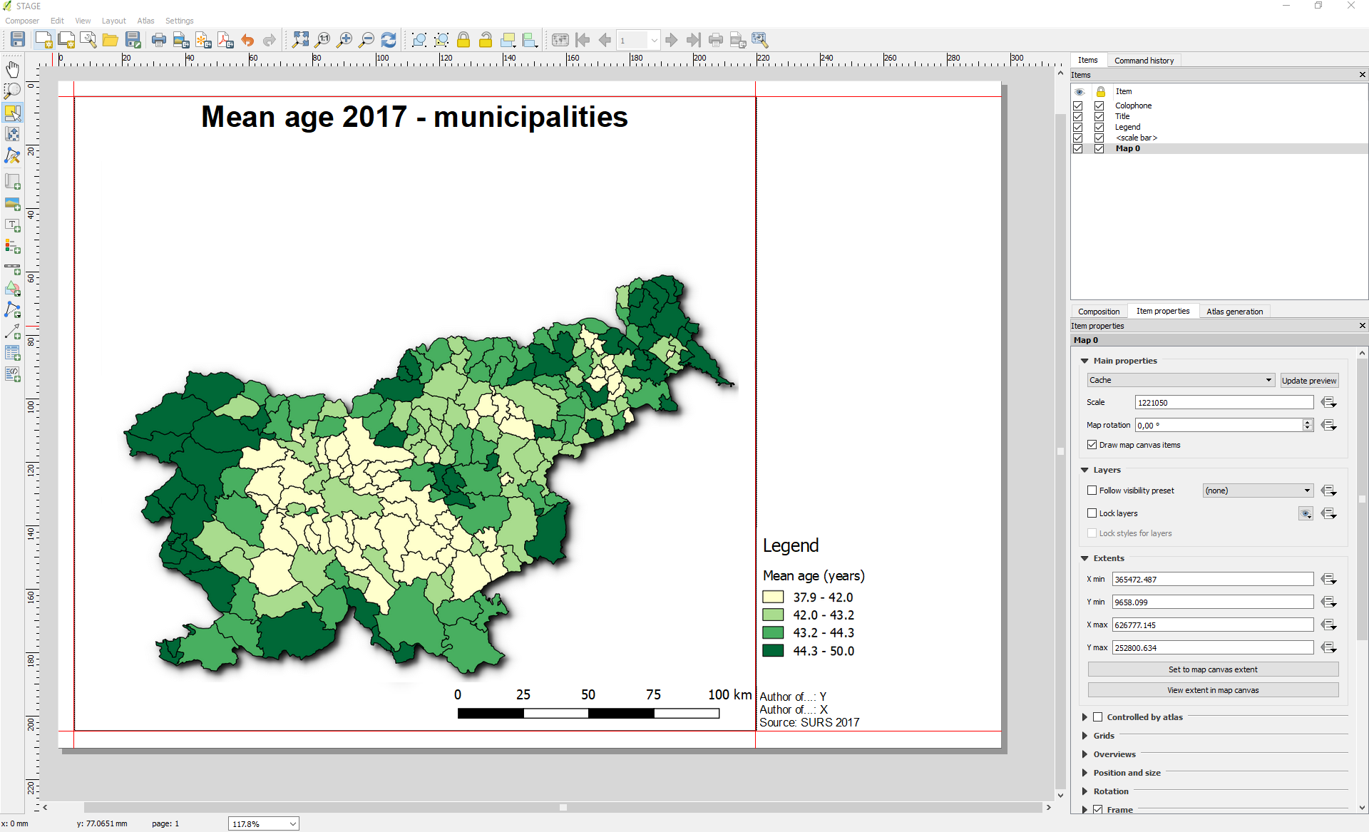
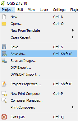
In Print Composer, we have the option to save the template and export the created maps. We can export directly into a PDF and SVG format (vector) or different raster formats (JPG, TIFF, PNG, etc.).
In case we want to print the map, we need to perform a colour transformation from RGB to CMYK. When talking about colour transformations, vector layers do not have a high risk of distortion. When dealing with raster layers of different colour ranges (eg orthophoto), we may risk exporting a product completely different from what we see. The current version of QGIS does not offer colour mode transformations from RGB to CMYK, but external tools can be used to edit it (e.g. Adobe Illustrator, Inkscape with the ExportPDFCMYK add-on, Krita). In this case, we export the image in an appropriate resolution, which is at least 300 dpi (dots per inch) for maps intended to be printed.
This is how looks like a map that we made fast and easily:
